Concept
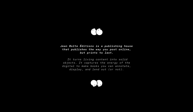
For Jean Boîte Éditions, a Parisian publishing house with a quirky tone and an editorial focus straddling contemporary art and internet culture, we developed a repositioning strategy built on a simple observation: we spend hours scrolling through emotionally charged digital content, yet we never retain any of it. JBE addresses this frustration by turning the ephemeral into something tangible, "a publishing house that publishes like we post, but prints to last."
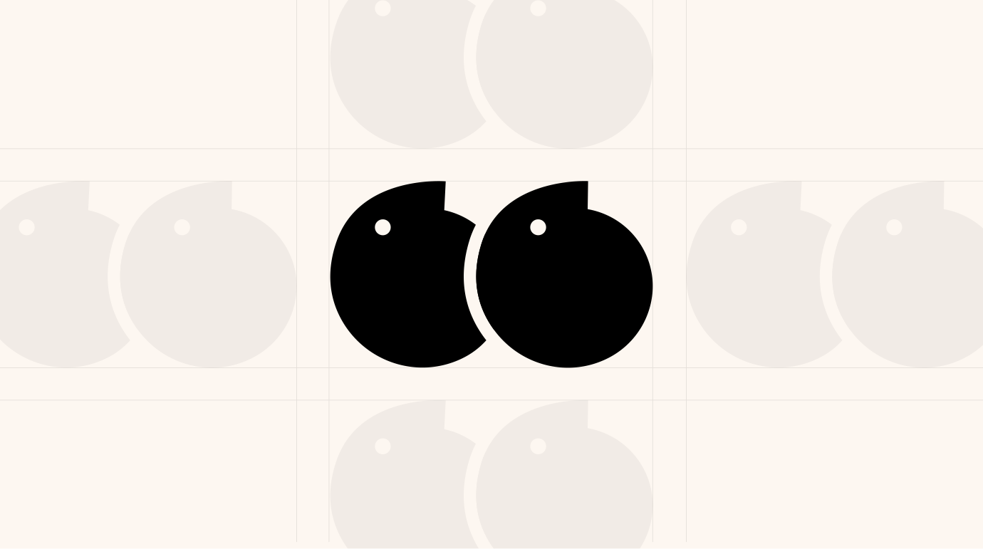
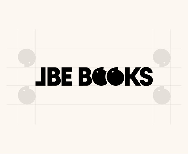
This idea was translated visually through a reinterpretation of the quotation mark, a symbol deeply rooted in the world of publishing, humanized into two characters tilted on their side, now the central element of the new visual identity.
We then extended this positioning through a new collection, Reviews, which compiles the funniest and most absurd reviews found online, literally a box within a box, true to the publishing house's DNA.
For Jean Boîte Éditions, a Parisian publishing house with a quirky tone and an editorial focus straddling contemporary art and internet culture, we developed a repositioning strategy built on a simple observation: we spend hours scrolling through emotionally charged digital content, yet we never retain any of it. JBE addresses this frustration by turning the ephemeral into something tangible, "a publishing house that publishes like we post, but prints to last."
This idea was translated visually through
a reinterpretation of the quotation mark,
a symbol deeply rooted in the world of publishing, humanized into two characters tilted on their side, now the central element of the new visual identity.
We then extended this positioning through
a new collection, Reviews, which compiles
the funniest and most absurd reviews found online, literally a box within a box, true
to the publishing house's DNA.
CLIENT
TEAM
2025
" transform="translate(1.005 1.372)" width="334.4949312210083px"/></svg>)
For Jean Boîte Éditions, a Parisian publishing house with a quirky tone and an editorial focus straddling contemporary art and internet culture, we developed a repositioning strategy built on a simple observation: we spend hours scrolling through emotionally charged digital content, yet we never retain any of it.
JBE addresses this frustration by turning the ephemeral into something tangible, "a publishing house that publishes like we post, but prints to last."
This idea was translated visually through a reinterpretation of the quotation mark, a symbol deeply rooted in the world of publishing, humanized into two characters tilted on their side, now the central element of the new visual identity.
We then extended this positioning through
a new collection, Reviews, which compiles
the funniest and most absurd reviews found online, literally a box within a box, true to the publishing house's DNA.
Concept
" transform="translate(1.005 1.372)" width="334.4949312210083px"/></svg>)
Client
TEAM

BACK
BACK